Chart Analysis #5 $SPX
Identify trends, entry and exit, Weekly, daily, LTF

How to Identify a Trend?
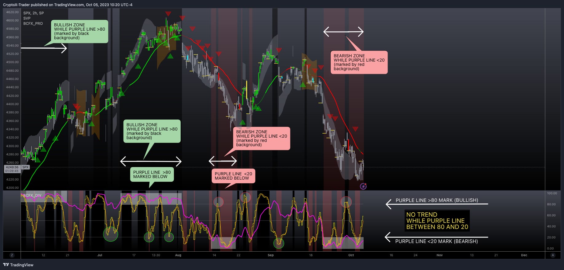
Lets discuss the significance of the divergence indicator's role in identifying trends.
Lower section of the above chart displays the divergence indicator with purple and yellow lines.
When the purple line rises above the 80 mark, it identifies a bullish zone.
The lower section of the chart highlights the purple line when it rises above the 80 mark.
The upper chart featuring the pro indicator, displays a black background when the purple line is above the 80 mark. This implies that the price action will actively create higher highs.
When the purple line falls below the 80 mark, you can spot a bearish zone.
The lower section of the chart highlights the purple line when it goes below the 20 mark.
The upper chart featuring the pro indicator, displays a red background when the purple line is below the 20 mark. This implies that the price action will actively create lower lows.
Every chart displays two trends. The monthly and weekly charts establish the primary trend, while the daily or 12-hour chart defines the secondary trend. You can use this information to perform scalping or swing trades when both trends point in the same direction.
When Should I Entry or Exit Positions?
Identify a trend, and then use the divergence indicator to pinpoint your entry and exit points.
For long positions (refer to above chart):
Do you see the green circle in the lower part of the chart? It spots the divergence cycle when the trend turns bullish. I suggest to scale in your long position as the purple line transitions from mark 50 to 20, and then from 20 to 50. The V shape pattern gives you the best opportunity to profit from the bullish trend.
For short positions (refer to above chart):
Do you see the red circle in the lower part of the chart? It spots the divergence cycle when the trend turns bearish. I suggest to scale in your short position as the purple line transitions from mark 50 to 80, and then from 80 to 50. The inverted V shape pattern gives you the best opportunity to profit from the bearish trend.
TIP: Build your position in small increments or scale in actively rather than opening the position all at once.


📊 Quick Analysis for $SPX 1H
Primary trend and secondary trend is bearish 🔻
Lets break down the 1 hour chart:
#1 Trend is bearish.
#2 You can spot multiple strong divergence cycles. Keep in mind that as the purple line remains below or near the 20 mark, the price action continues to print lower lows. The divergence indicator proves itself valuable in this aspect. It assists you in positioning yourself in the direction of the price movement
#3 The red circle indicates where to open a short position for swing trade or scalp. After the divergence cycle finishes or posts a new high, you have the option to close the short position.
Quick ToDo
Switch off the pro and divergence indicators or go to your seasoned tried or old indicator. Evaluate this chart ($SPX 1 Hour chart dated 5-oct-2023 12pm EST) and ask yourself, does your old indicator offer a justifiable reason to take the plunge and initiate a new short position, or does it compel you towards a speculative guess?
This is particularly significant as it emphasizes the importance of making informed trading decisions based on comprehensive data analysis rather than mere guesswork.
When you recognize the trend as bearish, you can use the divergence indicator to identify the following divergence cycle. As soon as the purple line begins to rise, creating higher highs and gradually moves from the 20 to 50 mark, it suggests that the likelihood of opening another short position decreases because the trend is starting to shift. Having this knowledge allows you to confidently open short positions as long as the purple line hovers near 20, highlighting the importance of this indicator.