


Chart Analysis #1 $BTC
Macro events, technical analysis, trading strategy


Highlights for this Blog
Macro Events
Technical Analysis
My Trading Strategy
TLDR
My Chart Analysis Indicator
⚡️ Macro Events
Last FOMC Meeting
Sep 2023: no changes to rates (0.00-0.25%)
The latest economic indicators imply a robust expansion in economic activity. While the rate of job creation has decelerated in the preceding months, it continues to exhibit strength, and the unemployment rate has consistently remained low. Inflation, however, continues to be high.
The banking system in the United States is deemed to be robust and resilient. Stricter credit conditions for households and businesses could potentially impact economic activity, employment, and inflation adversely. The magnitude of these effects is yet to be ascertained. The Committee continues to maintain a high level of vigilance towards risks associated with inflation.
Next FOMC Meeting
Nov 1, 2023: I anticipate that 1-2 additional rate hikes are in the books which will exert selling pressure on $BTC.
Next Bitcoin Halving in April 20, 2024
The expectation of this event is to trigger a surge in Bitcoin's price because it reduces the supply of new coins.

📊 Technical Analysis for $BTC
Chart Platform
I utilize the TradingView platform and perform chart analysis using the ‘Pro Bundle’ suite. Certain terminologies may pertain to the indicator setup on my chart. I will detail more on this at the end of this blog..
Trend Status
I analyze trends using the higher time frames (HTF) for the following reasons:
Ability to determine the primary and secondary trend. Use the monthly and weekly chart for the primary trend, and the daily or 12-hour chart for the secondary trend.
Determine my trading strategy (swing over a longer timeframe or scalp over a shorter timeframe).
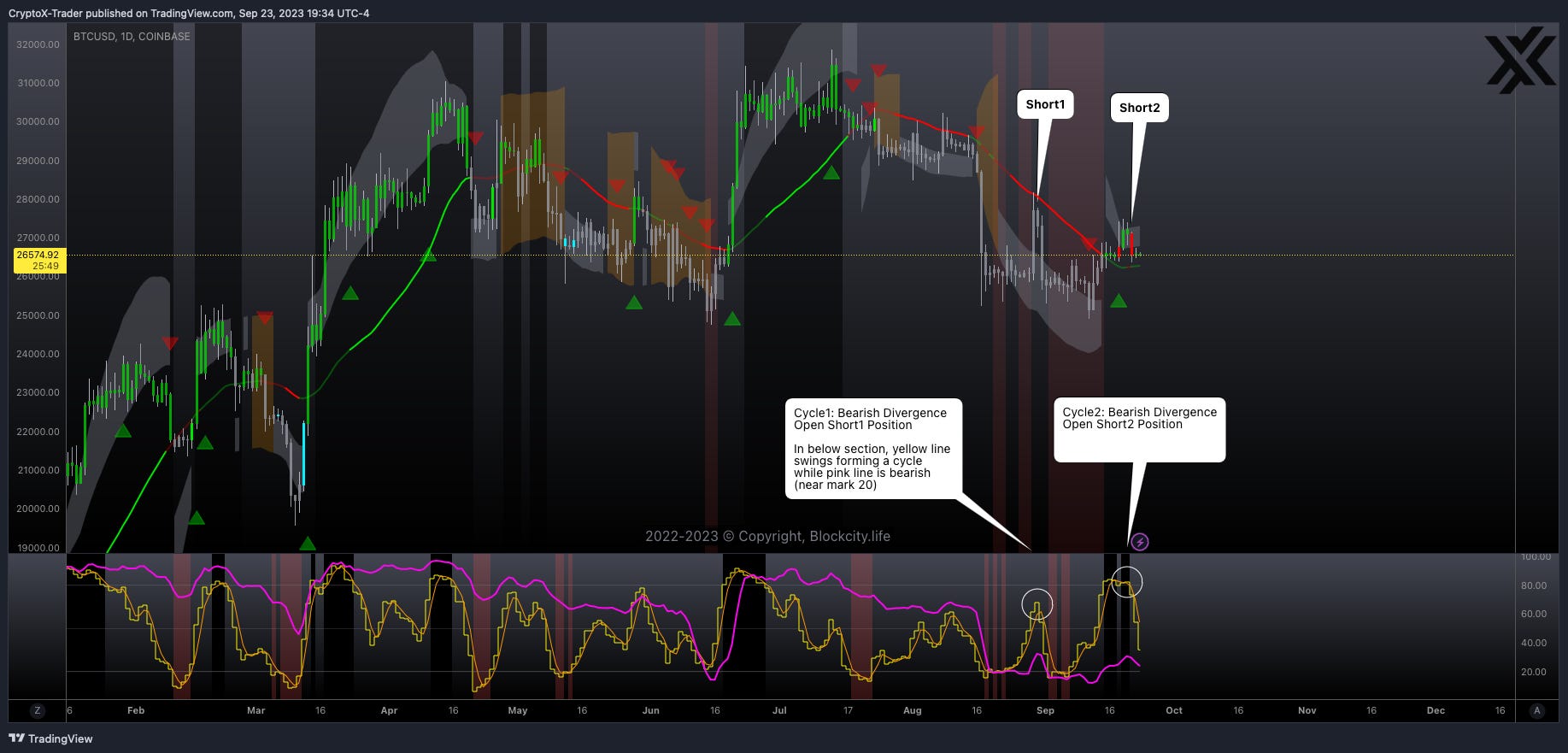
Referring to ‘chart1’,
Primary trend (monthly, weekly) is bearish 🔻.
Secondary trend (daily) is in process of completing its 2nd bearish divergence cycle.
Risk Level
My trading indicators show high and low risk trading zones. High risk zone implies secondary trend is not aligned with the direction of the primary trend. This causes price action to be volatile or range bound.
The above chart shows a low risk trading zone on the daily and weekly chart, evident from the red background in the upper section of the chart. Bearish zone corresponds to the red color, while the bullish zone corresponds to black color. A high risk zone doesn't have any color.
Risk level is currently high 🔺 as the monthly and weekly price action is not aligned in the same direction. (monthly is down and weekly is up).
Quick Analysis
The primary trend (monthly chart) shifted to bearish on Aug 1, 2022. From that point, my indicators have signaled 2 swing trades (shorts) and numerous scalp trades (shorts) on the secondary trend.
A few opportunities to go long on the 2-hour chart presented themselves, but I adhere to a disciplined approach. If the primary trend is bearish, I concentrate on shorts.
📚 My Trading Strategy
In my 9 years of trading and after reading countless journals, I've uncovered that the secret to successful trading doesn't solely lie in patience, a trading strategy, and a risk management plan. I've observed many traders who possess these qualities, yet they still fail overall or only manage a few lucky trades.
The secret to a successful trade hinges on the combination of two key factors:
Every chart has two trends (primary and secondary). Ensure both trends align in the same direction to perfect your timing.
Trade the divergence cycle (or wave) on the chart when the secondary trend shows strong momentum and volume.
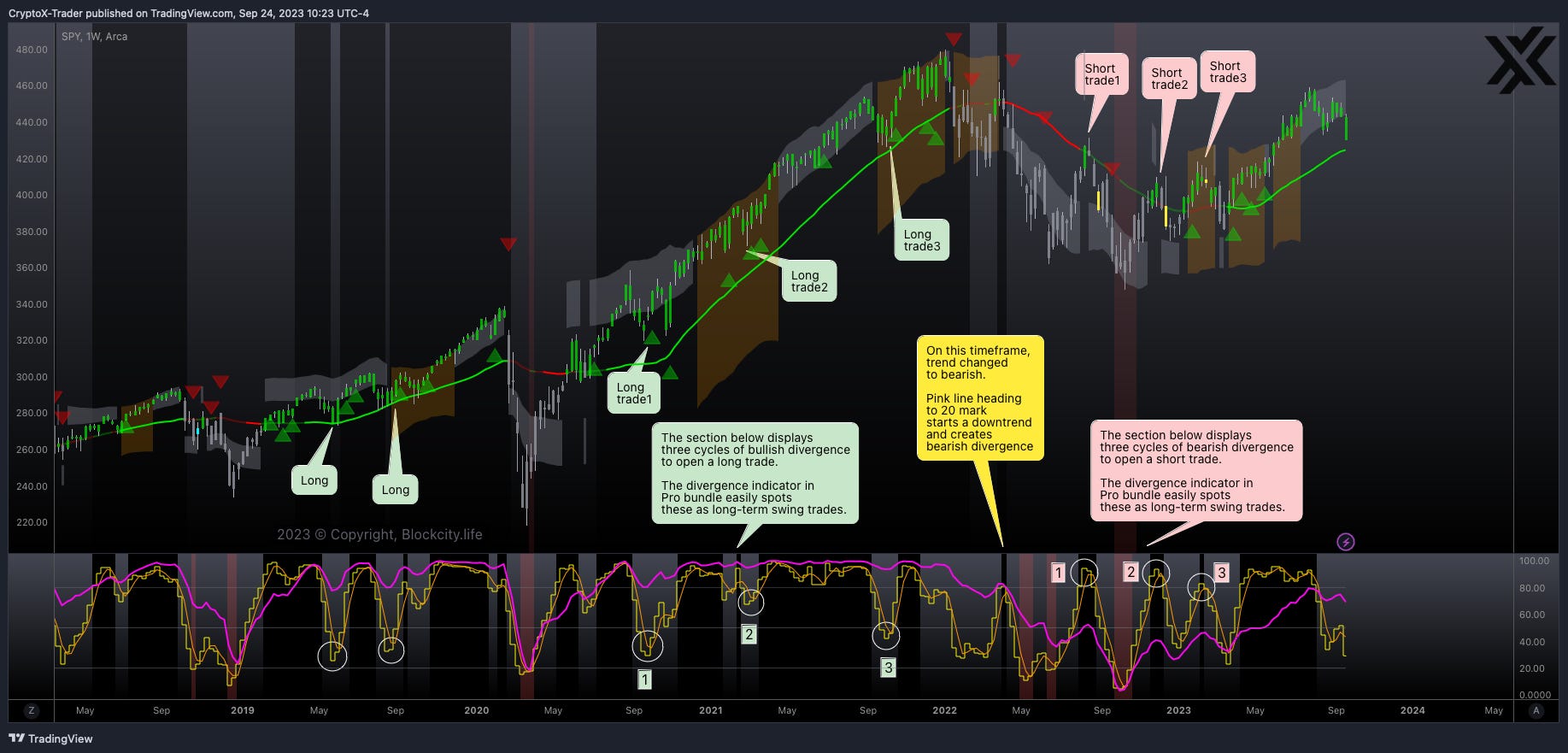
I will demonstrate the divergence cycle concept by analyzing the two swing trades mentioned in the previous section. Once you understand it, it's pretty simple.
Let's actively follow below steps to understand how to identify a divergence cycle on a chart:
Identify the upper and lower sections in ‘chart2’
Identify a bearish trend
Identify a divergence cycle
Identify a bearish divergence cycle
#1 Identify Chart Sections
Upper section shows price action in colored candles along with a combination of moving average, customized Bollinger bands, RSI, VWAP and risk zones.
Lower section shows the purple line (primary momentum) and yellow line (secondary momentum). In addition, there are 3 white horizontal lines spaced equally at different mark values 80 (top), 50 (middle) and 20 (bottom)
#2 Identify a Bearish Trend
When the purple line is near 20 mark (white horizontal line on lower side) then the trend is bearish and price action will make lower lows.
When the purple line is near 80 mark (white horizontal line on upper side) then the trend is bullish and price action will make higher highs.
#3 Identify a Divergence Cycle
We call it a divergence cycle when the yellow line swings from the bottom to the top (from the 20 mark to the 80 mark) and back to the bottom. The reverse cycle also applies from top to bottom and back to top.
#4 Identify a Bearish Divergence Cycle
When the purple line is around the 20 mark AND the yellow line oscillates from the bottom to the top and back down, a bearish divergence cycle forms (refer to chart2: white circle marks in lower section and comments for cycle1 and cycle2 in upper section). This suggests that a trader has the opportunity to open a short position as the yellow line hits the top, and close it when the yellow line finishes the cycle (or rides the wave) by returning to the bottom.
The reverse of above forms a bullish divergence cycle where the purple line is around the 80 mark and the yellow line oscillates from the top to bottom and back up. In this case, a trader has the opportunity to open a long position.
You are all set 👏
🥂 Take your time to identify the bearish divergence cycles marked in 'chart2'. I'm attaching additional charts ($SPY) to see the power of divergence indicator.

Divergence waves are a fascinating phenomenon that ripple through all market conditions. Spotting it is like finding a hidden treasure, and trading it with discipline can turn that treasure into a fortune!
✍️ TLDR
As the central authorities manifest intentions towards instituting one or more interest rate hikes, my projections lean towards the continuance of a primary bearish trend for Bitcoin. This trend is anticipated to persist unless there is a significant shift in market fundamentals, which could potentially be instigated by a noteworthy news event. One such event that comes to mind is the approval of a spot Bitcoin Exchange-Traded Fund (ETF). Such a development, indeed, carries the potential to reshape market dynamics and introduce a fresh perspective of bullish sentiment. Concurrently, the short-term outlook signals the commencement of yet another cycle of bearish divergence on the secondary trend.
🎯 My Chart Analysis Indicator
I use the 'Pro Bundle' to analyze charts on the TradingView platform. Pro bundle is the result of countless hours of expert research, experimentation, and refinement, drawing upon the collective wisdom and experience of seasoned professionals. It is a trading framework with a set of rules that help analyze any market condition, formulate buy and sell signals without any ambiguity or any subjective elements. This bundle, with its user-centric outlook, actively transforms the potentially overwhelming world of data and all vital signals into two straightforward indicators (Pro indicator, Divergence Wave Indicator) that are compatible with the free basic plan on TradingView platform.
Get ready for an irresistible deal! The first 1000 users are being offered a golden opportunity - FREE lifetime access! Don't let this chance slip away. Elevate your trading game to pro-level. Hurry, before it's too late!